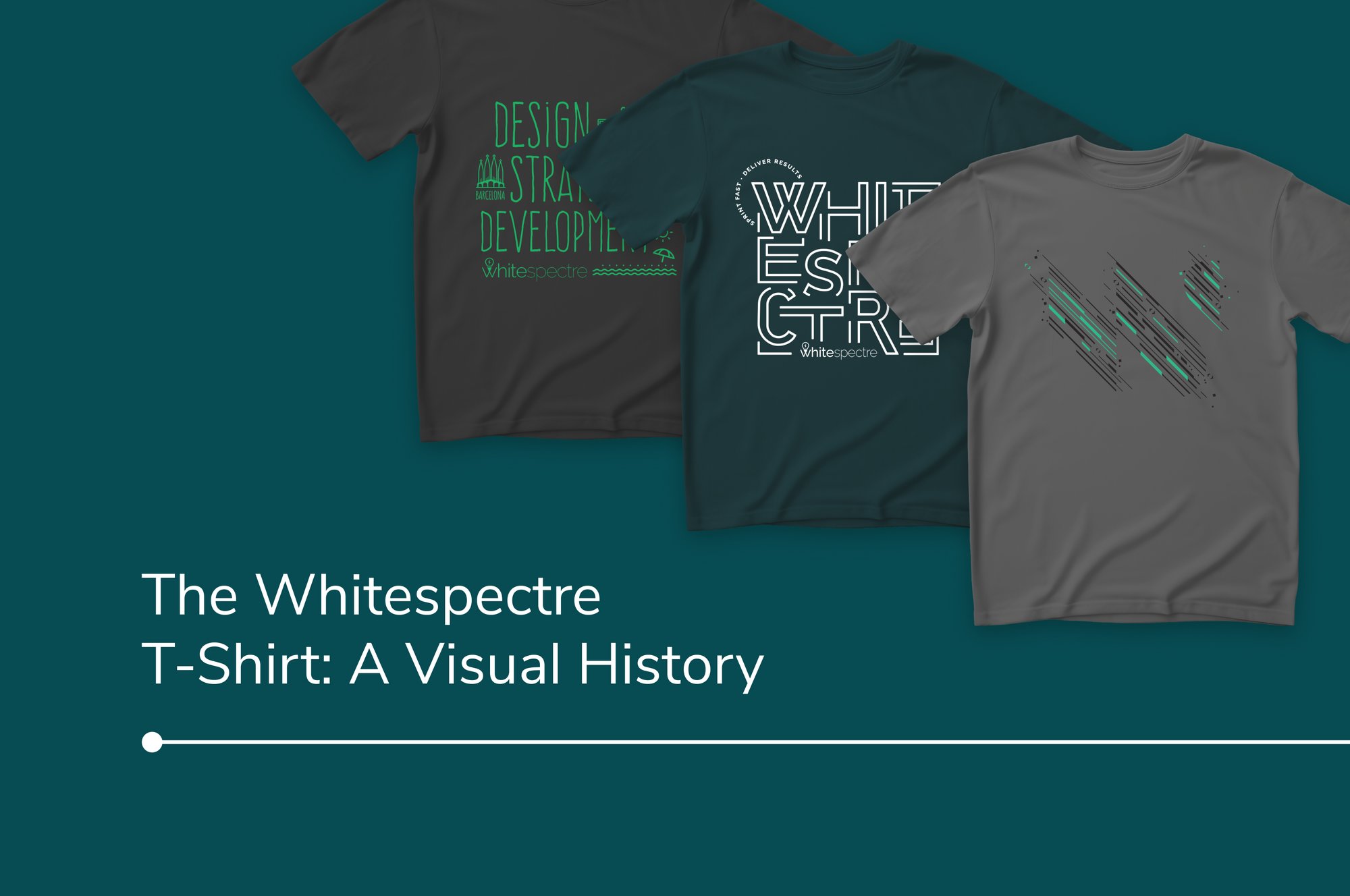
The Whitespectre T-shirt tradition dates back to 2016 when we were preparing for one of our week-long meetups in Barcelona. The company was expanding and, because we're a remote team, this was the first time many of our new members would meet face-to-face. The organizers decided to surprise everyone at the meetup with Whitespectre T-shirts. We put them on, raced to the beach to take pictures, and a tradition was born.
Our shirts are designed for, and by, the team. They’re a tangible, physical link to the company and each other, and the designs reflect how Whitespectre has evolved over the years. For this story, our CPO and Co-Founder Allison Kellman and UI/UX Lead Andy Simpson – both of whom have been closely involved in ideating and designing the shirts – sat down to discuss the history of the garment year by year and shirt by shirt.
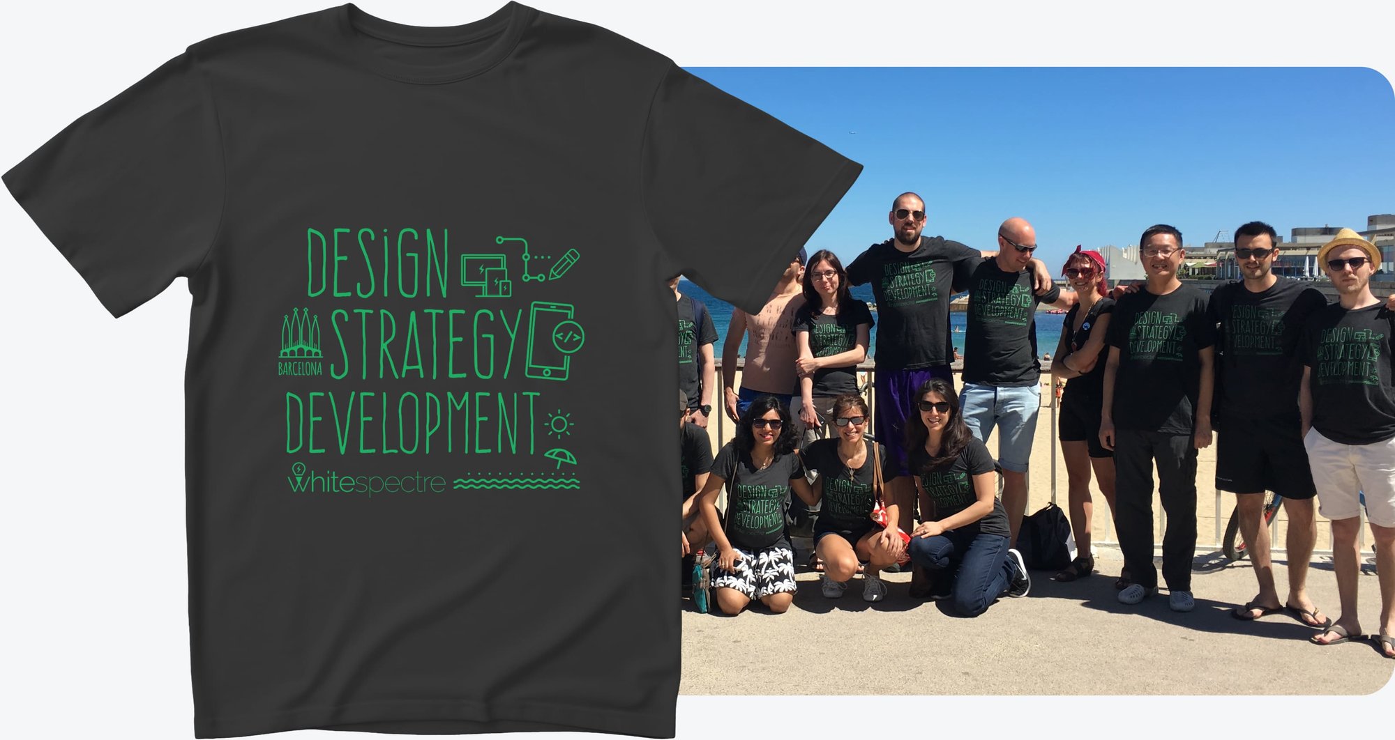
2016
Allison: Barcelona plays a central role in the first design – we had an office in Barcelona at the time – but the shirt was more of a tangible celebratory thing for our meetup. We wanted it to have a strong connection to the location.
Andy: I had gotten a bunch of similar T-shirts before from conferences, and I particularly liked one that I got in Boston, I think it was from Squarespace. It was quite heavily typographic, but with a mix of small imagery, type, and iconography.
Similarly, we featured our slogan at the time (“Design – Strategy – Development”) in a kind of a typographic way, but I wanted it to be fun, so that the typeface isn't too serious or techy. We then mixed in these elements of UI/UX and development and some Barcelona-based imagery – there’s the Sagrada Família on the left, you've got a representation of development and design, and some sort of beachy stuff down the bottom as well with our logo.
From the start, I’ve tried to think of these more as an illustration rather than a text-based design that you just read. But it’s all designed to just be fun, I wasn't trying to be serious at all with the design. I think we've since gone into a more sort of elevated fashion direction as we've gone on.
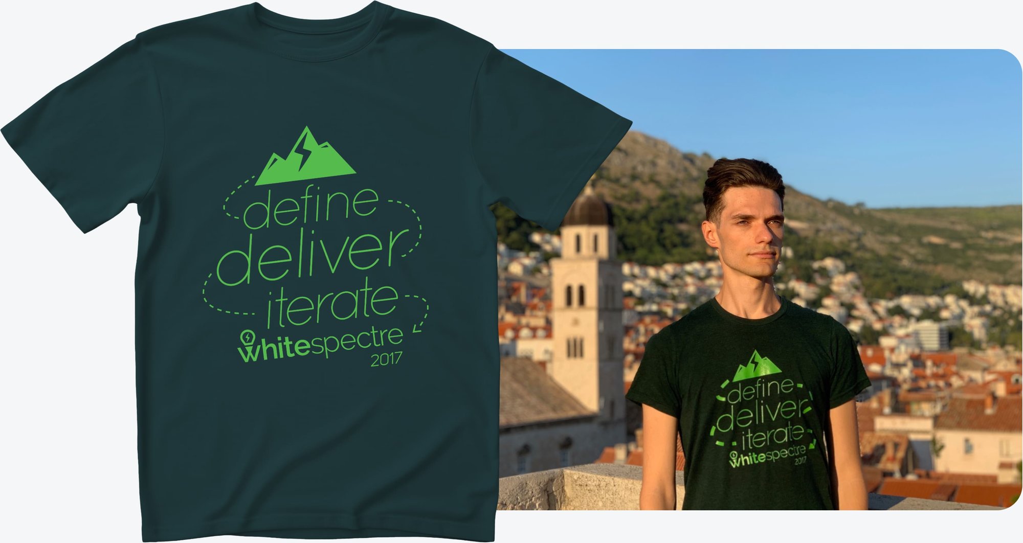
2017
Andy: With the second one, we stuck with the location thing. We figured we’d make this one more Andorra-based, that's where the mountains came from. Nick [Whitespectre CEO and co-founder who’s based in Andorra] is a big snowboarder, which is where we got the slalom motif going through the text. The “Define – Deliver – Iterate” slogan was introduced the same year when we relaunched our website.
This shirt’s color scheme is pretty unique as well. We've pretty much always used a charcoal shirt and fairly dark colors, but this time we went with this emerald green shirt and our older, brighter shade of green in the print.
Allison: One of the reasons why we’ve stayed with darker colors is that people do wear the shirts a lot, and my feeling was that white T-shirts are more likely to get stained and look worn out. So by sticking to a darker palette, people can hold on to them for longer.
2018
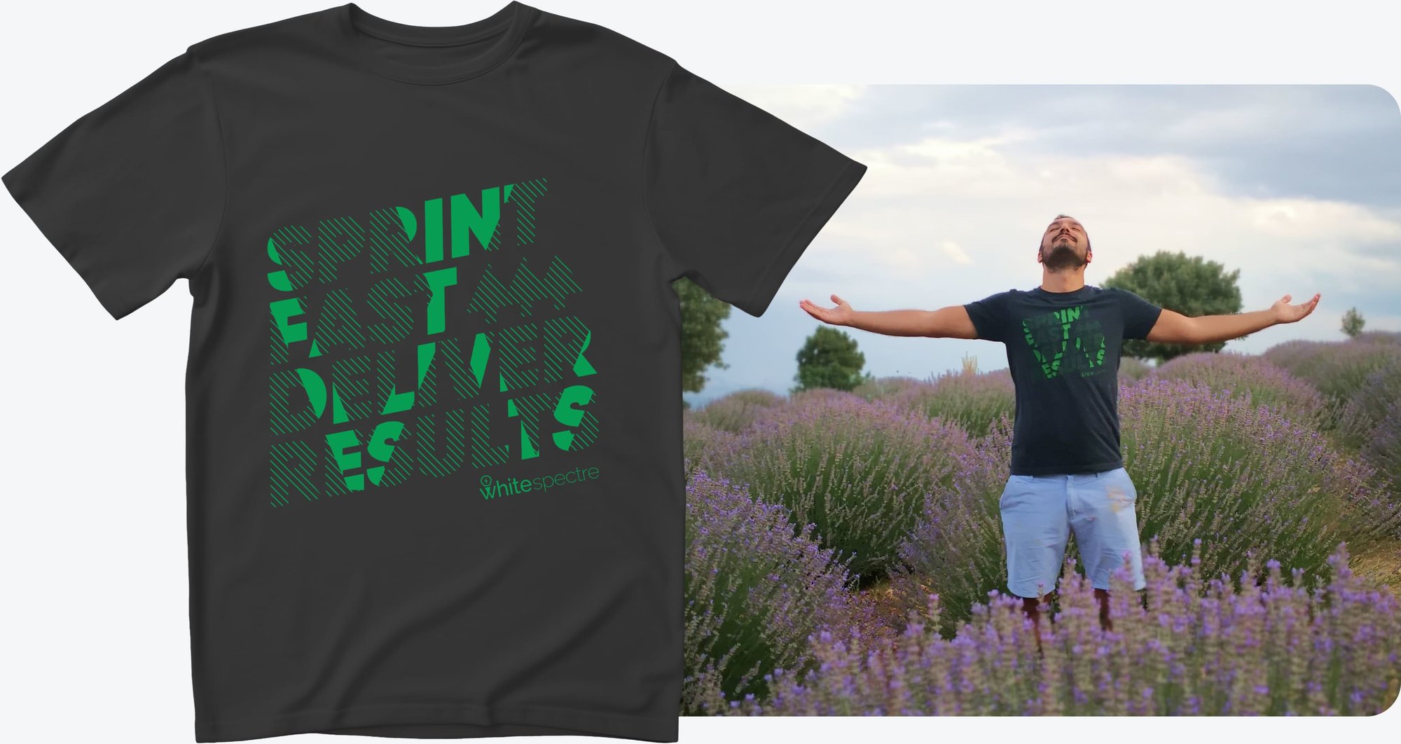
Andy: This is the year when we started the Workouts for Trees initiative, where we’d encourage our people to exercise by committing to plant trees based on their workout activity throughout the year. And because it’s been largely based on running, I wanted to move the visuals distinctly towards a sportswear aesthetic with the chunky, bold text, and the dynamic angle.
I think this is my favorite of them all. It's sort of subtle with the identity, but punchy at the same time. Usually we discuss around three different design ideas during the process, but this year I was quite insistent that this was what it was going to be. And it's been popular with our people as well.
Allison: And I think it was probably our most successful slogan, right? Because that always becomes a big thing – what copy are we going to put on this? So we landed on “sprint fast” because it recalls agile sprints in addition to running.
2019
Allison: 2019 was the only year when there wasn’t a T-shirt. There was a lot going on, it was very busy, and it just didn’t happen.
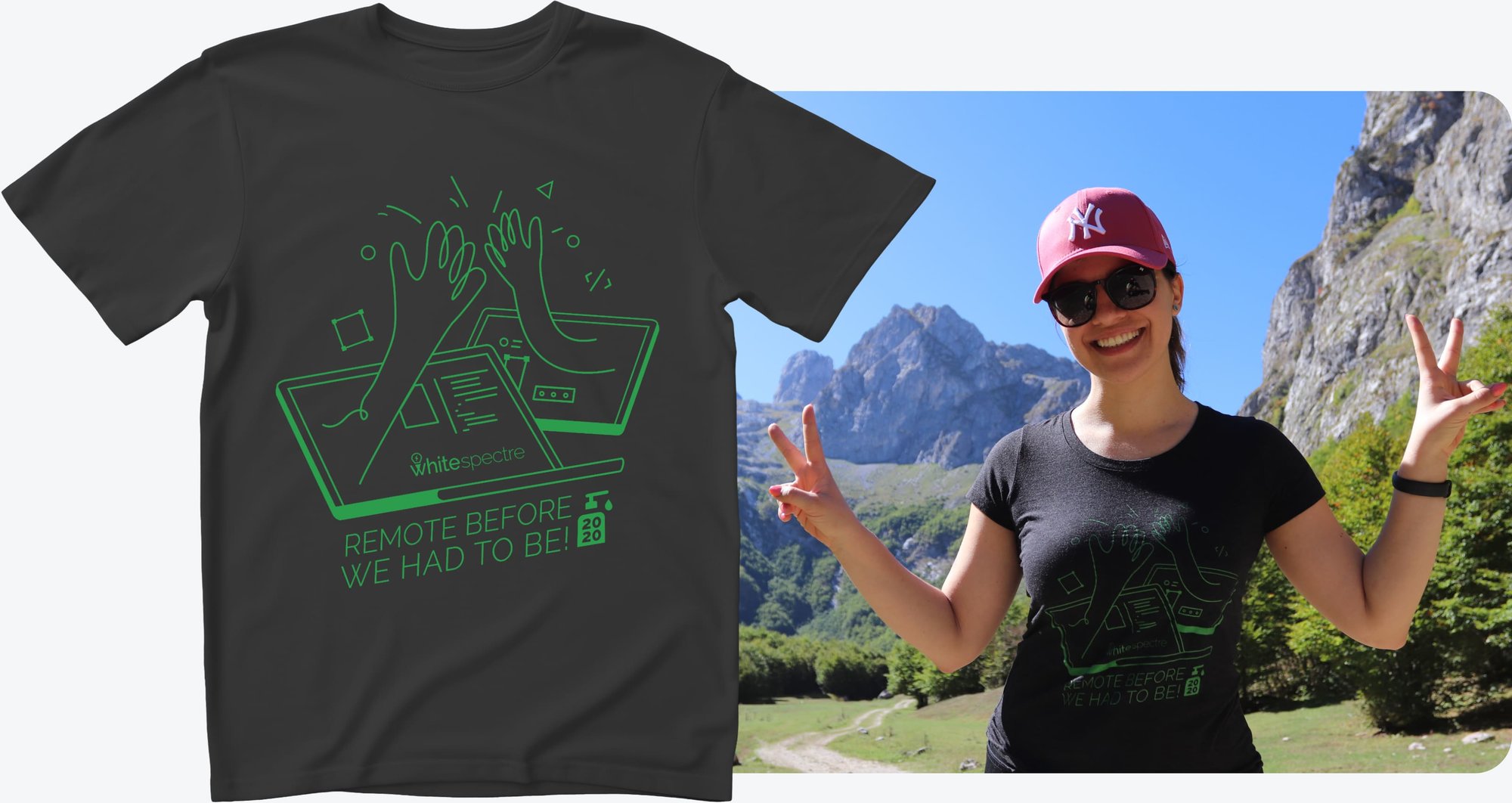
2020
Andy: I think this one's fairly obvious: even though we were apart, and we weren't doing meetups because of Covid, we were still connected through our teamwork. The “remote before we had to be” was speaking to the fact that unlike others, we weren’t new to remote, we'd been doing this forever – this is who we are. The little 2020 hand sanitizer is an obvious nod to Covid as well.
This one is also a bit more fun and loose in its execution. It was meant to be more fun because they were such dark times, and you have to have a bit of a laugh, right?
Allison: (laughs) Right, because what else are we going to do? “Remote before we had to be” was the one time we've been a bit cheeky on the design. But this was a more polarizing shirt as well. For some, this one felt too far from the usual typographic style.
Andy: It certainly was more cartoonish, and the message may not have been as literal as previous designs. It’s easy to tell we’ve moved toward a more abstract and simplistic direction after this. At the time we couldn’t very easily take parts of our visual identity and put them into use, so we always had to come up with an illustration or a typographic approach. This was in a way an early sign that we needed to revamp our branding.
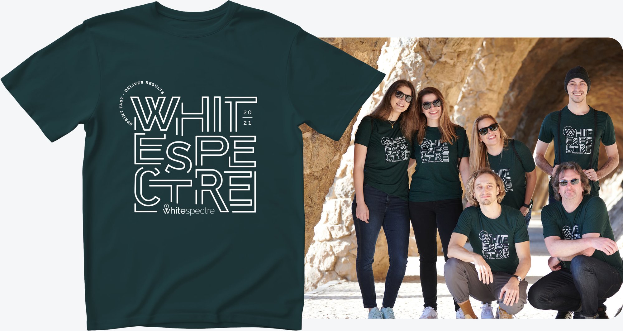
2021
Andy: This is the first shirt design that I wasn’t massively involved in, apart from giving some general direction to go back to toward a more typographic approach. This was done by our designer Florencia. It features the slogan in a smaller circular element, and it plays with a large typographic style with the outlines to avoid making it too heavy on the ink. You could think of this as a response to the previous one, as it’s a clear step away from the cartoony visuals.
Allison: It was great to have Flor take this one on and get new team members involved in it. We got to have fun with the letters again. It still features our old logo but we didn’t make it the star because we were approaching that pivot point of rebranding.
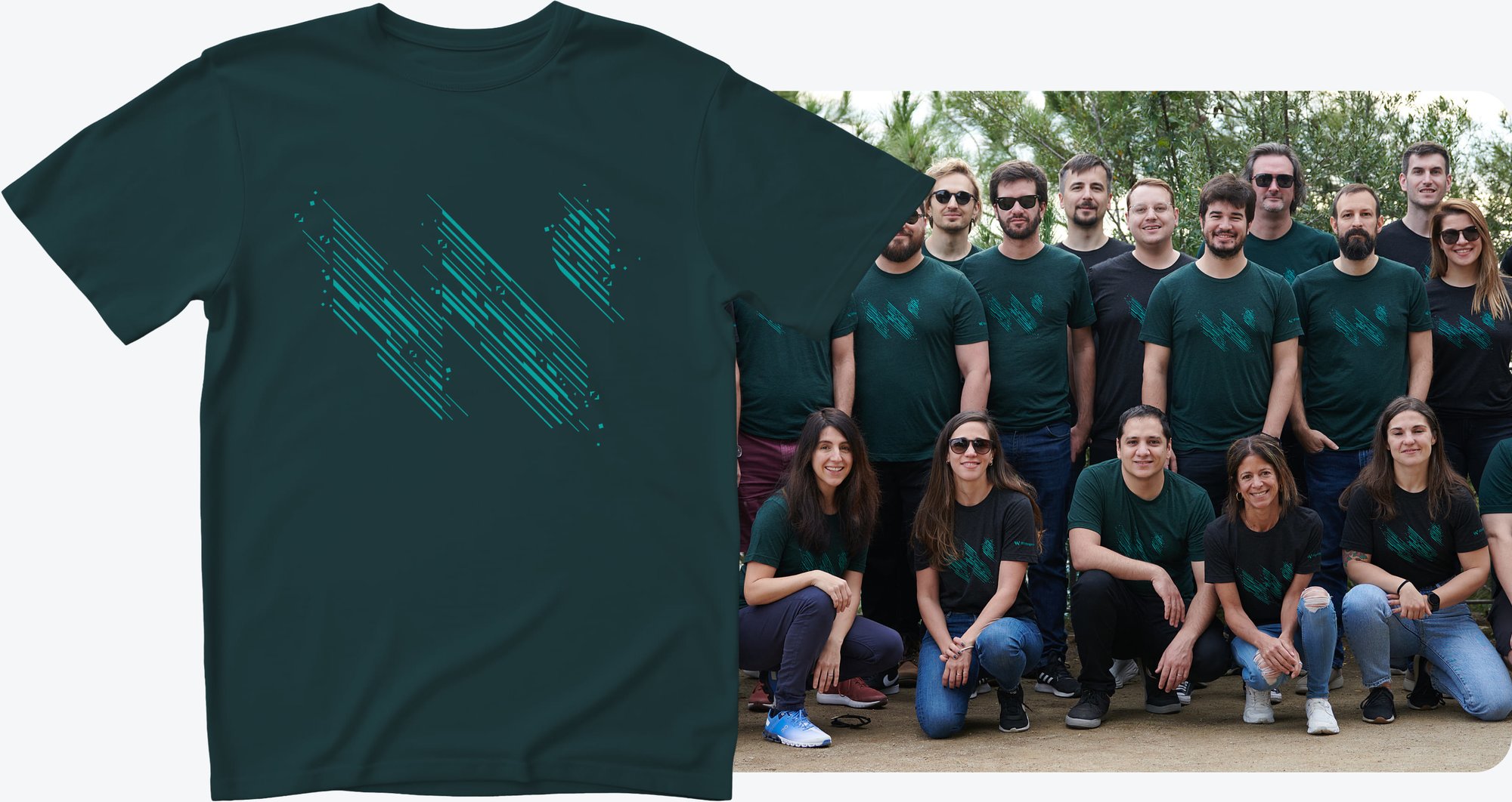
2022
Allison: …And this is the exact opposite, we went all in on the new logo.
Andy: Yeah, you can really see we were happy with it, right? It’s big and prominent. Our designer Macarena designed this one. This is the year we rebranded, so we didn’t want to dilute it by doing lots of other stuff. But at the same time, it felt too basic to just put the big W or a big “Whitespectre” on there, so we wanted to have a little twist on it, and again, avoid having a big slab of ink in the middle.
So we went ahead and added a nod to our work – the illustration has that dynamic feel to it again, and speaks to technology with these really subtle chevrons, so you can interpret it as lines of code. It’s nice that we have a very recognizable shape now, and even when we do little tweaks, it still reads quite nicely.
Allison: Yeah, I think this one might have been as popular as the “sprint fast” one. People really loved this one and were very excited about it.
2023
Allison: The previous design was so popular that when we were kicking around different ideas for 2023, Whitespectre’s 10th anniversary, we wondered if there was a way to build upon it.
We landed on bringing it back in the form of a “10th Anniversary Edition”. It’s very similar – but the print is two-tone, it’s got special markings on the sleeve, and the shirt itself is a much lighter shade than we’ve ever done. So we took something that was beloved and put a special spin on it.
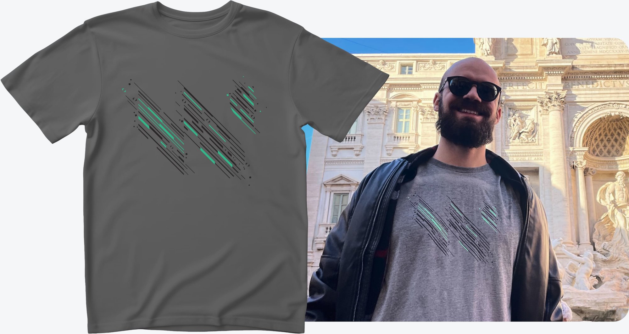
Andy: Yeah, we've used black and charcoal shirts before, and this mid-tone gray wouldn’t lend itself to working well with a primary green. So this bright mint color sort of harkens back to the brighter green that we used originally, nodding back to our roots, although it's not the same shade. The two tone design adds a surprising amount of depth that again makes it quite dynamic.
The design team also added these subtle little references to the world we live in with the corner handles in the box with the “10 years” label, and the typeface is a bit technical as well.
2024
Macarena: This was the first T-shirt with a design on the back. The intention for this edition was to convey movement. We’ve incorporated animations into our brand a lot this year, and that inspired the idea. We brought in recognizable elements from AI, voice control, and some of the other themes that have been present for us this year.
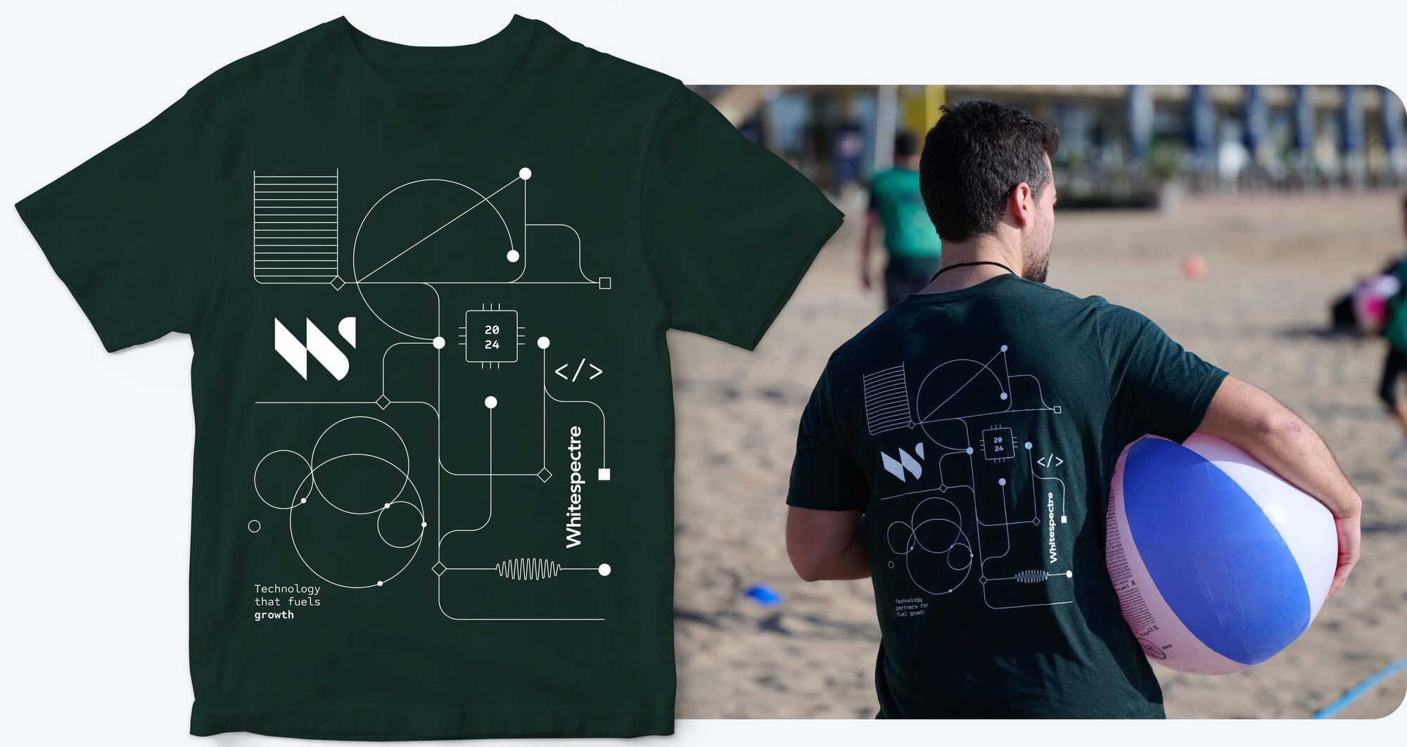
By combining all these elements and adding lines, curves, and intersections alluding to a grid, we achieved a design that captures the dynamic essence of Whitespectre and symbolizes our forward-thinking approach to technology.
The 2025 edition of the Whitespectre T-shirt will make its debut in the next few months. Stay tuned and keep your eyes peeled for an update!