As anyone who’s ever built an iOS app knows, keeping consistent yet flexible UI styles can be a lot harder than one would think. Unlike in web development, apps typically do not have a code-based style guide that extends across all app elements. In another of our brown bag sessions, Lucas Diez de Medina introduced us to STYLiSH, a swift-based framework which makes it easier to implement visual design in iOS apps . He showed us how the team extended the framework to create a web-like style guide for an iOS app we recently developed.
During the presentation, Lucas explained the issues around implementing design in iOS apps, gave us the pros and cons of the solutions provided by Apple, presented the benefits of STYLiSH, then talked through why and how the team chose to develop this style guide approach.
What Apple provides out of the box
Creating an app for Apple usually means using Interface Builder, Apple’s own development tool. There are multiple advantages for using this tool, such as its drag and drop functionality, being able to see changes in real-time, and support for multiple screen-sizes. It’s ideal for simple layouts with few custom components and requires the least amount of coding.
However, there are critical limitations that become a problem when you want to implement more complex styling
or change styles across the app. First, not all properties are editable. As an example, when you create a
button for an app, you can change the font and the background colour. But you can’t change the border
properties, shadows and other styling straight from Interface Builder. Second, if you need to
change a style across the app, for example changing all primary buttons from red to blue, you’ll need to make
that change in each place where there is a primary button.
The fix for this is to create custom components in the code, and then drag these custom-made items (such as a primary action button) into Interface Builder. Although this gives you more creative freedom, it requires a lot of code and sub-classes and can become difficult to manage. For example, you need to create a custom component for each button style. The more custom components you have in your app, the less scale-able it becomes.
The other problem with custom components is that any updates you make are not visible in real time. So, upon publishing the design, you might realise that something needs significant editing.
Apple-backed ‘solutions’ to Interface Builder’s limitations
There are currently two Apple-backed solutions to the limitations in Interface Builder, which are IBDesignables and IBInspectables. Both of these extend the functionality of Interface Builder, although they both come with their own set of pros and cons.
At a high-level, IBDesignables allows the developer to customise aspects of the design through code, such as border colours or the rounded corners for buttons and see these changes in Interface Builder.
IBInspectables allows you to extend properties that are editable in IB. However, as with other properties in Interface Builder, both these options can be fiddly , time consuming and not scalable when it comes to later customisations.
Creating a better solution
First a bit of background on the app we were developing and the specific circumstances.
At the start of development, we had high-fidelity wireframes, bordering on visual design. However, the company’s brand was still being developed. While our designers had been given a high-level direction for the target aesthetic, we didn’t have the final colors, fonts, or core visual brand elements that we’d typically translate into the final visual design for the user interface. In addition, creating a beautiful consumer experience was very important for this company’s brand and target customer.
We needed to begin development on the app to meet the company’s timelines. But we also wanted to minimize the development effort to implement styling later on. Our team needed a flexible approach.
Finally, while there were particular circumstances in this case that made this flexibility even more important, we had seen many instances on other projects where we needed to make styling updates across an app to align with a company’s re-branding or just give it a fresher look.
Here’s what the team was looking for:
- A solution that makes it easy to customise and scale across multiple components, such as buttons, widgets and typography
- A tool that is code independent, with the option to use CSS or JSON files that are easier to understand (as much as is possible)
- Able to view updates and changes in Interface Builder easily without too much effort
- No need to define custom classes for different components
- Able to access the code so that we can support new properties in the future, such as when Apple includes new properties in an iOS update.
Introducing STYLiSH
STYLiSH is an open source solution built by an independent programmer, and is available on Github. Built using Swift, STYiLSH allows developers creating iOS apps to customise aspects and properties of their project easily, without having to spend time manually updating individual chunks of code.
Put simply, STYLiSH takes a JSON or Swift style file, like a CSS, and acts as a central point to apply custom styling to a UI component, and then show these updates in real time in Interface Builder.
Using a visual storyboard approach, the developer can define a visual element such as a colour, button or font, and apply that style easily across your design.
How we extended STYLiSH to create our app style guide
Out of the box, STYLiSH supports a number of things, including:
- Support for editing native elements such as UI buttons, UI labels and UI views
- Ability to edit default property stylers as well as new components as and when they’re released by Apple
- Ability to easily define styles in JSON
- Support for extensions to add additional functionality
These were the extensions we wrote, (supported by STYLiSH)
- Support for custom components such as custom text fields
- Support for non-native components such as navigation bars, activity indicators and tab buttons
- New property stylers to apply styling to extra attributes (like UIButton enabled/disabled in the background)
And these were the improvements we made to the library:
- Support for ’Constant Values’, i.e. the ability to apply values sucha as colours and fonts across the whole project
This final library improvement saved us a ton of time when it came time to change the fonts and key colors, both in terms of development and QA. By simply updating the constant values, we instantly changed the key colors and fonts across the entire app.
How you can integrate STYLiSH into your project
This is what you need to do to integrate STYLiSH into your project:
- Integrate STYLiSH framework (Carthage, Submodule, project itself). You can find further instructions in the Stylish Github page.
- Create a class that implements Stylesheet protocol and assign an instance of it to STYLiSH styles
- Define the JSON file and use it to load the styles dictionary
- Additionally, include any links to resources such as custom fonts
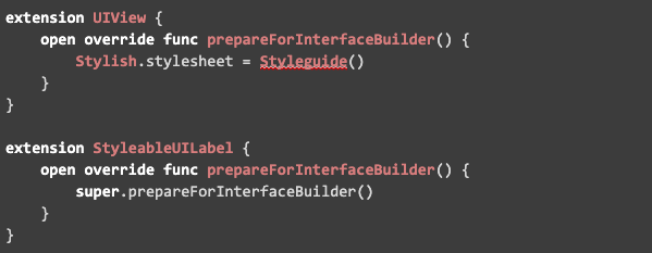
- In order to use IBDesignables and make IB automatically render your updates, include the following:
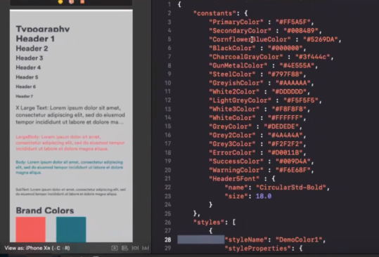
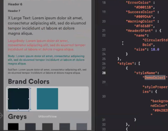
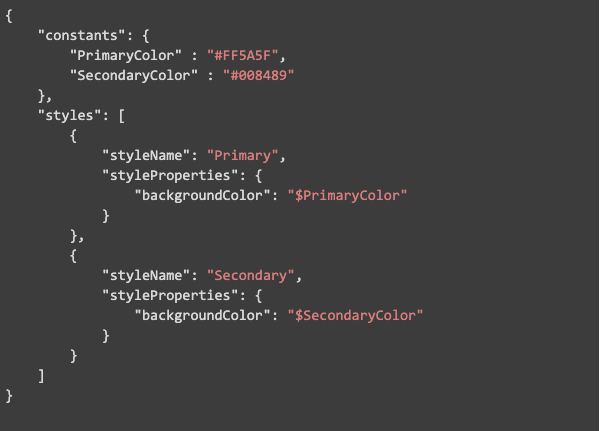
Here’s a very simple JSON file that demonstrates how to apply a background color to a UIView:
As Lucas notes, although it took perhaps a days work to update the JSON file for use with STYLiSH, the amount of time saved overall was significant. After going through this process, the team also identified some areas they’d like to improve in the future, including potentially building a Sketch plugin. Stay tuned for a future post with more details on that!
Update - Using SwiftUI
Since this article was published, a lot of things happened in the world of UI Development for iOS. Apple released SwiftUI, which uses a declarative syntax to define your interfaces. SwiftUI is compatible with other UIKit components, and it’s based on swift, which means you can define variables and functions to generate the parameters that define your UI.
With SwiftUI, Apple also introduced new tools to Xcode that allow you to see your changes in real-time using the `adjoining editor`. And the best thing is that the synchronization works both sides: you can write code and see the changes in the UI, or you can add UI components with the drag-n-drop feature and see the changes in code. Apple took this even further and introduced ‘Dynamic replacement’, which means that your changes are constantly compiled and sent to your app, so you can see the changes almost instantly in your running app, on your device.
SwiftUI solves pretty much all the use cases for which we used STYLiSH in the past, and it’s the recommended approach if you’re starting an app from scratch.